
Some thought redirecting charts in here:)
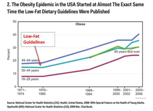
I’ve been sharing Chart 2 for a few years now in my presentations
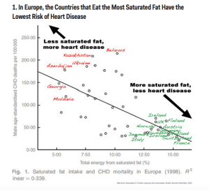
And I love Chart 1. Which finally shows the real curve that Ancel Key’s adulterated.
To see more, go to:
http://www.businessinsider.com/our-war-on-fat-was-a-huge-mistake-graphs-2013-11
But remember the idea isn’t just to eat more fat and better quality fat. You have to restrict the carbs majorly and the protein moderately at the same time or else you won’t end up in a much different place.
Find out what to do, if you don’t already, in my 5 Resources Report top right.